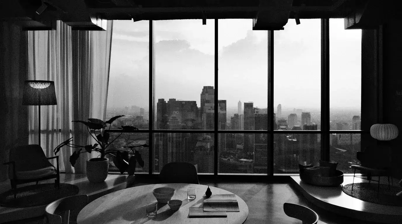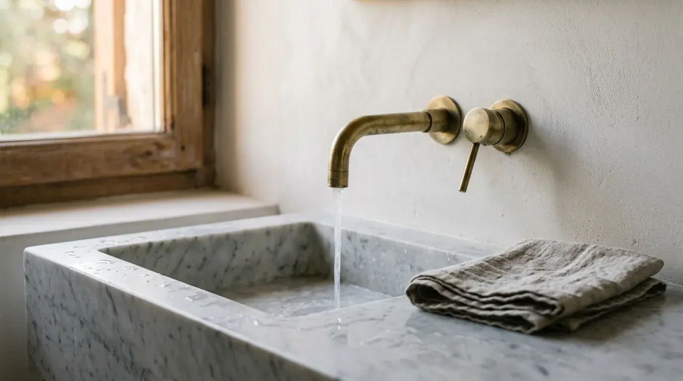
You do not need a renovation to make a home feel expensive. A small number of considered upgrades — in materials, lighting and finish — can do more for the perceived quality of a space than knocking down walls. The trick is spending where the hand and eye actually land.
Start with what you touch: door handles, tap fittings, light switches. Swapping plastic for solid brass or brushed steel is modest in cost relative to its impact and reads immediately as quality. Then lighting — warm, layered lamps beat a single overhead light in almost every room and cost comparatively little.
Textiles are the next lever: heavier curtains, a pure-wool throw, natural-fibre bedding rather than synthetic. These soften a room and signal care. The principle throughout is to buy better rather than more.
Outdoors counts too — a tidy, well-furnished garden or balcony extends the sense of a considered home. Our outdoor-living guide covers the materials and pieces that earn their place.
Why some rooms read as expensive
Before spending anything, it helps to know what the eye is actually responding to. It is three things, and none of them is cost.
Light quality. Not brightness — quality. Warm light from several low sources at different heights reads as expensive; a single cold ceiling light reads as institutional, regardless of what it is illuminating. This is why the cheapest intervention in this article is also the most effective.
Material honesty. A surface that is what it appears to be reads as calm. A surface pretending to be another material reads as busy, because the eye keeps checking. Solid brass, real stone, actual wood, genuine linen — and, equally, honest painted MDF that is not pretending to be oak.
Edges and alignment. Where things meet is where cheapness shows. A skirting board with a clean mitre, a tile run that ends on a full tile, a curtain that reaches the floor, a switch plate that sits flush. None of these cost much; all of them are noticed subconsciously.
Everything below is an application of those three.
Lighting, in order of impact
Colour temperature first. Warm bulbs make skin, wood and textiles look right; cool bulbs make everything look like a waiting room. Standardise the temperature across a room — mismatched bulbs in one space is the single most common and most fixable error in ordinary homes.
The US Department of Energy's purchasing guidance puts numbers on it:
| Colour temperature | Description | Where the DOE lists it |
|---|---|---|
| 2,700 K | Warm: friendly, personal | Homes, libraries, restaurants |
| 3,000 K | Soft: warm, pleasing | Homes, lobbies, restaurants |
| 3,500 K | Neutral: friendly, inviting | Executive offices, reception areas |
| 4,100 K | Cool: neat, clean, efficient | Offices, classrooms, showrooms |
Source: US Department of Energy, FEMP. For a living room or bedroom that means a bulb marked 2,700 K or 3,000 K, and the same number on every bulb in the room.
Then colour rendering. Look for a colour-rendering index figure on the packaging. It describes how faithfully a light source shows colours, and where a manufacturer does not print it, that omission is itself information. The same DOE guidance calls colour rendering index a measure of light quality, with a higher value meaning a better light source, and notes that ENERGY STAR-qualified bulbs must have a CRI of 80 or greater, so treat 80 as the floor rather than as a mark of quality.
Then the number of sources. A room lit by three or four low lamps at different heights has depth; a room lit from a single overhead point is flat and shadowless. This is the change that people describe as "it feels like a hotel", and it costs the price of two lamps.
How bright should each lamp be? Bulbs are sold by lumens, and the DOE gives the conversion: about 450 lumens replaces a 40-watt incandescent bulb, 800 lumens a 60-watt, 1,100 a 75-watt and 1,600 a 100-watt, with the LED equivalents drawing roughly 4.5 to 7, 5.9 to 10.5, 9.5 to 14 and 10.5 to 18 watts. Worked through: a room lit by one 100-watt-equivalent ceiling bulb gets about 1,600 lumens from a single point. Three lamps with 800-lumen LED bulbs give 2,400 lumens from three heights and draw 17.7 to 31.5 watts between them (3 × 5.9 to 3 × 10.5), less than a third of the old 100-watt bulb. On a dimmer, you then choose how much of that light to use.
Then dimming. The ability to take a room down in the evening does more for how a house feels than almost any furniture purchase. If you want lamps to switch together or on a schedule, our guide to smart-home technology covers retrofit devices that avoid rewiring.
Finally, hide the source. Shades, uplighters and diffusers mean you see lit surfaces rather than bulbs. A visible bare bulb is a design statement that has to be made deliberately or not at all.
The touch points
The objects your hand closes around every day are disproportionately powerful and almost always overlooked. Door handles, tap fittings, light switch plates, cupboard pulls, the pull cord in a bathroom.
Solid metal has weight and thermal mass — it feels cool then warms. Plated plastic does neither, and the hand notices instantly even when the eye does not. Replacing the handles in a single room is an afternoon's work and changes the perceived quality of everything they are attached to.
Two practical notes. Measure the fixing centres before ordering cupboard pulls, because a different spacing means filling and drilling. And commit to one metal finish per room rather than mixing three, which is the mistake that makes an expensive set of fittings look accidental.
Edges, alignment and the cheap tells
- Curtains that stop short of the floor, or that are hung at window height rather than close to the ceiling.
- Rugs too small for the furniture arrangement, leaving legs half on and half off.
- Pictures hung too high — most artwork in most homes sits above eye level.
- Visible cable runs, extension leads and chargers on surfaces.
- A tile or floorboard run that ends on a sliver against a wall.
- Mismatched white paint on skirtings, ceilings and walls in a single room.
- Fixtures at slightly different heights on either side of a bed or a mirror.
Textiles, and where the money shows
Weight is the variable that separates good textiles from poor ones, and it is rarely printed. Ask for fabric weight in grams per square metre where you can; heavier curtains hang in proper folds rather than draping like sheets, and heavier upholstery survives.
Fibre content is normally stated on the label, and it is worth reading. Wool, linen and cotton behave differently from synthetics under light and over time — they crease more and they last longer.
The textile purchases that change most homes the most are, in order: proper curtains hung high and wide, one large rug rather than several small ones, good bedding, and one heavy throw. That order is deliberate, because it goes from most visible to least.
Bedding is the one you touch every night, so read the fibre content and weave rather than the marketing. Groundluxe, which sells organic-cotton sheets and bedding, is one maker we link to; whichever you consider, check what certification is claimed for the cotton and confirm it on the certifier's own site rather than taking the product page's word for it. For the Global Organic Textile Standard that means its public Certified Suppliers Database, which itself warns that certification bodies are still updating their data and says to contact the certification body when a company is missing (GOTS, certified suppliers).
A worked example, with invented numbers
These figures are invented and are not real product prices. The point is the allocation, not the amounts.
Suppose a budget of 1,000 for one living room. A common instinct is to spend it on one statement piece of furniture.
An alternative allocation: 250 on three lamps and warm dimmable bulbs, 300 on curtains hung high and wide, 250 on a rug large enough for the seating arrangement, 100 on solid door and cupboard handles, and 100 on hiding cables and re-hanging the pictures at the right height.
The second allocation buys nothing anyone would photograph individually and transforms the room. The single statement piece buys one good object in a room that still reads as flat. Both are legitimate; only one of them changes how the space feels every evening. If you are unsure which change your own house needs first, the six-question upgrade finder points you to the guide to read before you spend anything.
What to skip
Faux materials that imitate a specific other material — the imitation is what registers, not the material. Matching furniture sets, which read as showroom rather than assembled. Anything sold as "hotel style" that is not actually built to hotel durability. And scented, seasonal or decorative accessories bought in volume, which are the fastest way to spend real money on an effect that lasts a fortnight.
Finish with one or two genuine objects — an original artwork, a piece of real craft, something inherited — rather than a quantity of mass-produced decoration. Real materials read differently from imitations, and a single good object can lift a room more than a dozen cheap ones.
Where an original is not yet in the budget, one well-framed print of a work you genuinely like does that job better than a shelf of accessories. Posterbox, a poster shop that prints in Sweden, sells prints after Hilma af Klint, Edvard Munch, Henri Matisse, Paul Klee and William Morris alongside its own designs, and sells frames as well. Hang it at eye level rather than above it.
For furniture and lamps, Best Choice Products, which sells home and outdoor furniture, is one range we link to; apply the tests above — material honesty, weight, and whether the piece suits the room's proportions — to anything you consider, wherever you buy it. More on interiors, outdoor rooms and home technology is collected in our House & Garden department.
Frequently asked questions
How can I make my home look expensive on a budget?
Spend where the hand and eye land: warm light from several low lamps instead of one ceiling light, solid-metal handles and switch plates in place of plated plastic, curtains hung high and wide, one rug large enough for the furniture, and hidden cables. None of these needs a builder.
What lighting makes a room look expensive?
Warm bulbs of one matching colour temperature across the room, a good colour-rendering figure, three or four sources at different heights, dimming, and shades or diffusers so you see lit surfaces rather than bare bulbs. A single cold overhead light reads as institutional whatever it illuminates.
What makes a house look cheap?
Mostly edges and imitation: curtains that stop short of the floor, rugs too small for the seating, pictures hung too high, visible cables, tiles ending on a sliver, mismatched whites, and surfaces pretending to be another material. Most of these cost little to fix.
How do you make a bedroom feel luxurious?
Start with what you touch every night: good bedding, chosen on fibre content and weave rather than marketing, then heavy curtains hung close to the ceiling, a heavy throw and warm bedside lamps at matching heights. If a product claims organic or certified cotton, confirm the certificate on the certifier's own site.
What does CRI mean on a light bulb?
Colour rendering index, a measure of how faithfully a light source shows colours; higher is better. The US Department of Energy notes that ENERGY STAR-qualified bulbs must reach at least 80, so treat 80 as the minimum rather than as a sign of quality.
How bright should lamp bulbs be?
Compare lumens, not watts: about 450 lumens replaces a 40-watt incandescent, 800 a 60-watt and 1,600 a 100-watt. Three 800-lumen LED lamps give more light than one 100-watt ceiling bulb while drawing under a third of its power.